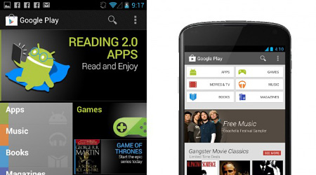
Google Revamps Google Play For Android

Michael Siliski, group product manager for Google Play, announced that the media hub and app store has had an interface redesign. Google has begun implementing the update of the redesigned Android marketplace for Android phones and tablets which are running Android 2.2 Froyo or higher.
The differences in the two interfaces show the current design trajectory Google has been going with many of it existing properties. Gone is the wasted space at the top which has been replaced by a dedicated row of buttons for the various media sections
"Similarly themed content is grouped together so you can hone in on a magazine to read or an app to try," writes Siliski.
The focus of the redesign was to provide bigger images that "jump off the page" while being "simple [and] clean" to help users find content faster. Additional recommendations appear as the user scrolls down the interface similar in fashion to Netflix design cues.
The check out process has also been updated to simplify purchasing media and apps to make spending your money a more streamlined experience. The Google Play redesign is currently being rolled out in the U.S. with International Android users receiving the update in the next few weeks.


